How to Choose the Perfect Brand Colour Palette
Your brand’s colour palette is more than just aesthetics—it’s a strategic tool that influences how your audience perceives and connects with your business. Choosing the right colours can make your brand more memorable, evoke emotions, and even influence buying decisions. In this guide, we’ll help you navigate the process of selecting a colour palette that perfectly aligns with your brand’s identity and goals.
Why Your Brand’s Colour Palette Matters
Colours are powerful communicators. They evoke emotions, create associations, and significantly impact how your audience feels about your brand. A well-chosen colour palette ensures that your brand is instantly recognisable and sets the tone for how you interact with your customers.

Colour Psychology in Branding
Each colour has a psychological effect, and understanding this is key to choosing the right palette:
- Red: Represents energy, passion, and urgency.
- Blue: Communicates trust, professionalism, and calmness.
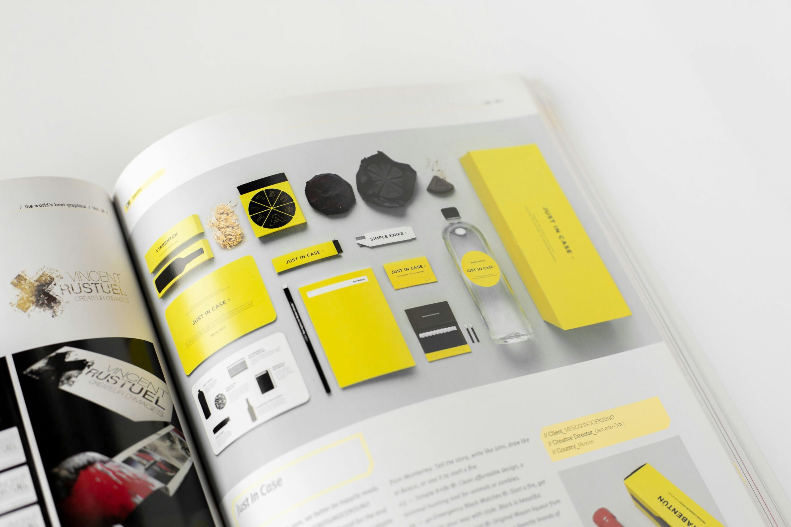
- Yellow: Evokes happiness, optimism, and youthfulness.
- Green: Symbolises growth, health, and sustainability.
- Black: Exudes sophistication and luxury.
By understanding these associations, you can select colours that align with your brand’s values and message.
Steps to Choosing the Perfect Colour Palette
Step 1: Define Your Brand Identity
Before selecting colours, you need to be clear on your brand’s identity. Ask yourself:
- What are your brand’s core values?
- How do you want your audience to feel when interacting with your brand?
- Who is your target audience?
For instance, a luxury brand might lean towards gold and black, while an eco-friendly company could focus on green and earthy tones.

Step 2: Study Your Competitors
Analyse the colour palettes of competitors in your industry. This can help you identify trends and differentiate your brand. While it’s useful to stay within industry norms, adding unique colour elements can help your brand stand out.
Step 3: Choose a Primary Colour
Your primary colour is the main colour that will represent your brand. It should reflect your brand’s core values and personality. For example, a tech company might choose blue to represent trust and innovation.

Step 4: Add Supporting Colours
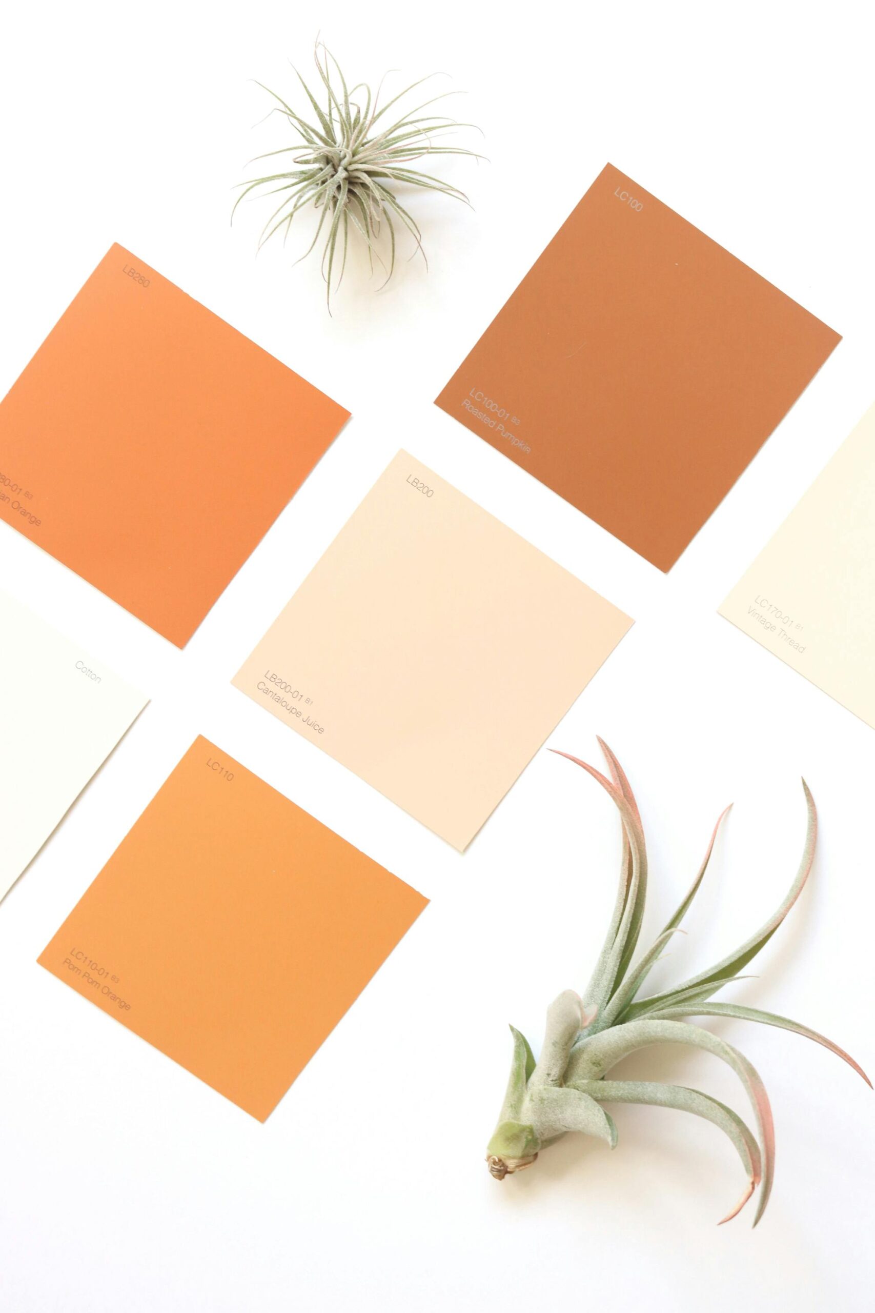
Supporting colours complement your primary colour and create balance in your designs. These can be used for accents, secondary elements, or specific marketing materials. Use a colour wheel to find harmonious combinations such as analogous, complementary, or triadic schemes.
Step 5: Test Your Palette Across Platforms
Your colour palette will be used across various touchpoints—your website, social media, print materials, and more. Test how the colours appear on different screens and mediums to ensure consistency and effectiveness.
Tools to Help You Choose the Right Colours
There are several tools available to assist you in creating a cohesive colour palette:
- Adobe Color: Create custom palettes and explore trending colour schemes.
- Coolors: Generate quick and easy colour combinations.
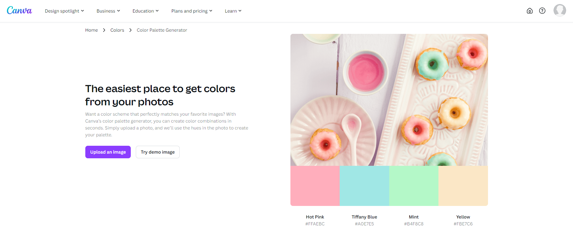
- Canva Color Palette Generator: Upload an image, and Canva will create a palette based on it.
These tools simplify the process and help you visualise your colours before implementation.

Common Mistakes to Avoid When Choosing Colours
Overloading with Too Many Colours
Stick to 2-4 main colours to keep your brand consistent and memorable. Too many colours can confuse your audience and dilute your message.
Ignoring Accessibility
Ensure your colours are accessible by checking contrast ratios for readability, especially for text. Tools like WebAIM’s Contrast Checker can help.
Neglecting Emotional Impact
Choosing colours based solely on trends can backfire if they don’t align with your brand’s message. Focus on what resonates with your audience emotionally.
Conclusion: Crafting Your Brand’s Identity Through Colour
Choosing the perfect colour palette for your brand is both an art and a science. By understanding colour psychology, defining your brand identity, and using the right tools, you can create a palette that not only looks beautiful but also communicates your brand’s values effectively. Your colour choices are one of the most critical aspects of building a memorable and impactful brand.
Let’s start designing your unique brand palette today!

